本記事ではt-SNEの実際のコード例を紹介します。
特に、重要なパラメータであるperplexityを変えての描画結果と標準化との組み合わせを扱っています。
データとしては、wine-quality datasetの赤ワインのデータを使用します。
t-SNE自体の説明については、こちらにまとめたので適宜ご参照ください。
perplexityの意味の確認
perplexityは、t-SNEにおいて、分布の分散を決める際に使用されるパラメータでした。
平たく表現すると、どれだけ近傍の点を考慮するかを決めるためのパラメータとも解釈することができます。
元論文には5~50程度が典型的だとの記述がありましたので(SNEの場合)、およそこの辺りで探すことが多いかと思います。
詳しくは先述のこちらの記事にまとめています。
描画の際には一つの値で決め打ちにするのではなく、複数並べるのが基本的なアプローチになるかと思います。
この辺りについては、下記のリンクの記事が非常に分かりやすく、参考になるかと思います。

また、コードについては基本的な部分はscikit-learnのドキュメントのコード例を参考にしています。こちらも併せてご参照ください。
コード例
それでは、コード例に入っていきます。
事前準備として後で重要になってくるのは以下のX, y, y_itemsです。
import numpy as np
import pandas as pd
import matplotlib.pyplot as plt
%matplotlib inline
import os
import time

from sklearn.preprocessing import StandardScaler
from sklearn.manifold import TSNE

data_path = "../../00_input/wine-quality/winequality-red.csv"
wine_red_df = pd.read_csv(data_path, sep=";")

X, y = wine_red_df.drop(["quality"], axis=1), wine_red_df["quality"]
y_items = y.unique()
今回使用したwine-quality-redのデータセットは1599行、12列からなります。
このデータセットにはqualityというラベルを示す列と、その他値が入っている列が11列あります。
ここでは、quality以外の列から構成されるデータフレームをX, qualityの列をyとしており、
y_itemsには以下のようなnumpy.arrayが入っています。
array([5, 6, 7, 4, 8, 3])
なお、このデータセットではラベルの数にはかなりばらつきがあることには留意が必要です。
y.value_counts()
5 681
6 638
7 199
4 53
8 18
3 10
Name: quality, dtype: int64
ほとんどが5と6で、7がその次に多い他はかなり数が少ないです。
とはいえ、今回の描画上はあまり意識せずに進めていきます。
t-SNEの基本的な使い方
まずはシンプルに1枚だけ決め打ちにした場合の描画です。
n_components = 2
perplexity=30

start_time = time.time()
fig, ax = plt.subplots(figsize=(5,5))
tsne = TSNE(n_components=n_components, init='random', random_state=0, perplexity=perplexity)
Y = tsne.fit_transform(X)
for each_quality in y_items:
    c_plot_bool = y == each_quality # True/Falseのarrayを返す
    ax.scatter(Y[c_plot_bool, 0], Y[c_plot_bool, 1], label="Quality: {}".format(each_quality))
end_time = time.time()
ax.legend()
print("Time to plot is {:.2f} seconds.".format(end_time - start_time))
描画結果はこちらです。
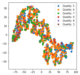
あまり何がどうなっているかの情報は得られなさそうです。
使用する関数の準備
以降では、perplexityを振るトライアル、3次元での描画およびplotlyでの描画を行います。
これらの作業を(1)元データに直接t-SNE、(2)標準化のそれぞれに行うため、
手間を省くためにここで関数を準備してしまいます。
以下では4つの関数を定義しています。
1つ目は2次元のプロットを複数のperplexityに対してまとめて作成する関数。
2つ目は3次元版。
3つ目は一つのperplexityに対する変換結果を吐き出す関数でplotly用に使用しています。
4つ目がplotlyでの描画用関数です。
更なる効率化の余地はありそうですが、今回はこの4つの関数で話を進めていきます。
あまり気にしない方はこの部分は飛ばしていただいても問題ありません。
from mpl_toolkits.mplot3d import axes3d
import plotly.plotly as py
import plotly.graph_objs as go
import os
from plotly.offline import iplot, init_notebook_mode

def create_2d_tsne_plots(target_X, y, y_labels, perplexity_list= [2, 5, 30, 50, 100]):
    """
    args:
        target_X: pandas.DataFrame.
        y: list or series owning label infomation
        y_labels: labels in y. This is set as argument becaunse only some labels are intended to be ploted.
        perplexity_list: list of integers.
    Returns:
        None
    """
    fig, axes = plt.subplots(nrows=1, ncols=len(perplexity_list),figsize=(5*len(perplexity_list), 4))
    for i, (ax, perplexity) in enumerate(zip(axes.flatten(), perplexity_list)):
        start_time = time.time()
        tsne = TSNE(n_components=2, init='random', random_state=0, perplexity=perplexity)
        Y = tsne.fit_transform(target_X)
        for each_label in y_labels:
            c_plot_bool = y == each_label
            ax.scatter(Y[c_plot_bool, 0], Y[c_plot_bool, 1], label="{}".format(each_label))
        end_time = time.time()
        ax.legend()
        ax.set_title("Perplexity: {}".format(perplexity))
        print("Time to plot perplexity {} is {:.2f} seconds.".format(perplexity, end_time - start_time))
    plt.show()
    return None


def create_3d_tsne_plots(target_X, y, y_labels, perplexity_list= [2, 5, 30, 50, 100]):
    """
    args:
        target_X: pandas.DataFrame.
        y: list or series owning label infomation
        y_labels: labels in y. This is set as argument becaunse only some labels are intended to be ploted.
        perplexity_list: list of integers.
    Returns:
        None
    """
    fig = plt.figure(figsize=(5*len(perplexity_list),4))
    for i, perplexity in enumerate(perplexity_list):
        ax = fig.add_subplot(1, len(perplexity_list), i+1, projection='3d')
        start_time = time.time()
        tsne = TSNE(n_components=3, init='random', random_state=0, perplexity=perplexity)
        Y = tsne.fit_transform(target_X)
        for each_label in y_labels:
            c_plot_bool = y == each_label
            ax.scatter(Y[c_plot_bool, 0], Y[c_plot_bool, 1], label="{}".format(each_label))
        end_time = time.time()
        ax.legend()
        ax.set_title("Perplexity: {}".format(perplexity))
        print("Time to plot perplexity {} is {:.2f} seconds.".format(perplexity, end_time - start_time))
    plt.show()
    return None


def create_single_3d_tsne(target_X, y, y_labels, perplexity, close_plot=True):
    """
    args:
        target_X: pandas.DataFrame.
        y: list or series owning label infomation
        y_labels: labels in y. This is set as argument becaunse only some labels are intended to be ploted.
        perplexity_list: list of integers.
    Returns:
        Y: target_X transformed to 3d by tsne.
    """
    fig = plt.figure(figsize=(5,5))
    ax = fig.add_subplot(1,1,1, projection="3d")
    start_time = time.time()
    tsne = TSNE(n_components=3, init='random', random_state=0, perplexity=perplexity)
    Y = tsne.fit_transform(target_X)
    for each_label in y_labels:
        c_plot_bool = y == each_label
        ax.scatter(Y[c_plot_bool, 0], Y[c_plot_bool, 1], label="Quality: {}".format(each_label))
    end_time = time.time()
    ax.legend()
    ax.set_title("Perplexity: {}".format(perplexity))
    print("Time to plot perplexity {} is {:.2f} seconds.".format(perplexity, end_time - start_time))
    if close_plot:
        plt.close()
    else:
        plt.show()
    return Y

def create_single_plotly_3d_scatter(target_df, y, y_labels):
    init_notebook_mode(connected=True)
    config={'showLink': False, 'modeBarButtonsToRemove': ['sendDataToCloud','hoverCompareCartesian']}

    data = []

    for each_label in y_labels:
        c_plot_bool = y == each_label
        scatter_info = go.Scatter3d(
                                    x=target_df[c_plot_bool, 0],
                                    y=target_df[c_plot_bool,1],
                                    z=target_df[c_plot_bool,2],
                                    mode='markers',
                                    marker=dict(
                                        size=1),
                                        name="Quality: {}".format(each_label))
        data.append(scatter_info)

    layout = go.Layout(
                scene=dict(
                    xaxis = dict(title="x"),
                    yaxis=dict(title="y"),
                    zaxis=dict(title="z")
                    )
                )


    fig = dict(data = data, layout=layout)
    iplot(fig, config=config)
    return None
また、perplexityについては、下記の5つに固定することにします。
この値は、こちらの記事で扱われていた値が妥当だと感じたので、参考にさせていただいています。
https://distill.pub/2016/misread-tsne/
perplexity_list = [2, 5, 30, 50, 100]
それでは、それぞれの描画結果を見ていきましょう。
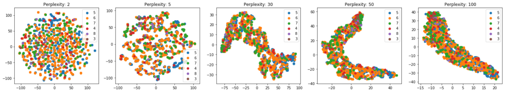
perplexityを振った場合
まずはシンプルにperplexityを振った結果です。
create_2d_tsne_plots(X, y, y_items, perplexity_list)
 また、3次元での結果は次のようになります。
create_3d_tsne_plots(X, y, y_items, perplexity_list)
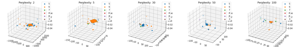
3次元での描画結果を見ると、perplexityは5か30かどちらかが良さそうなので、
今回はperplexityを5としてplotlyで詳しく見てみることにしましょう。
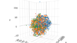
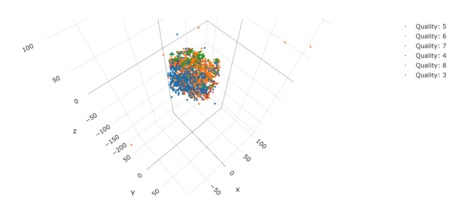
Y = create_single_3d_tsne(X, y, y_items, 5)
create_single_plotly_3d_scatter(Y, y, y_items)
描画結果のスクリーンショットがこちらです。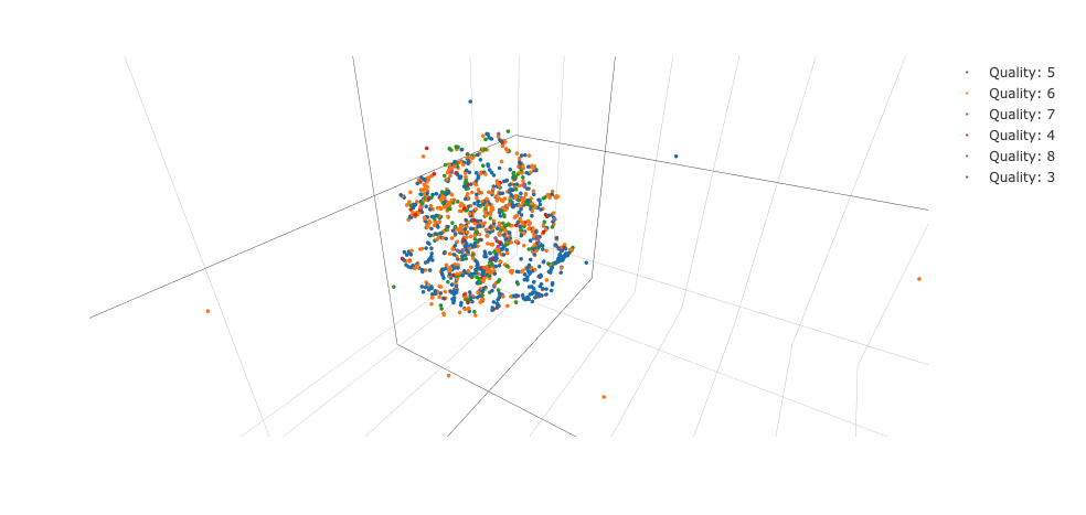
若干分かれている気もしますが、なんとも言えない結果です。
一応perplexity30の場合も確認しておきます。
Y = create_single_3d_tsne(X, y, y_items, 30)
create_single_plotly_3d_scatter(Y, y, y_items)
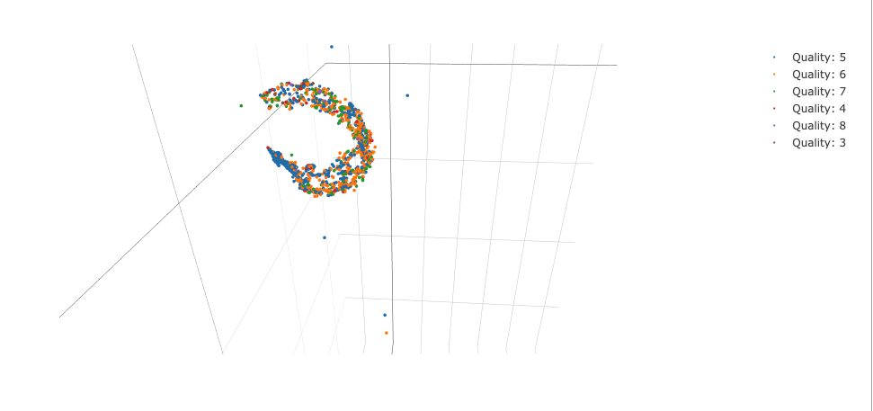
なかなか個性的な形状になりました。
t-SNE使用時はこのような形になることがしばしば見られます。
標準化との組み合わせ
続いて、標準化との組み合わせを行なっています。
流れは先ほどと同様ですが、事前に標準化を施しておきます。
scaler = StandardScaler()
scaled_X = scaler.fit_transform(X)
まずは2次元のプロットを行います。
create_2d_tsne_plots(scaled_X, y, y_items, perplexity_list)
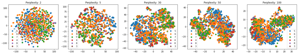 続いて、3次元のプロットです。
create_3d_tsne_plots(scaled_X, y, y_items, perplexity_list)

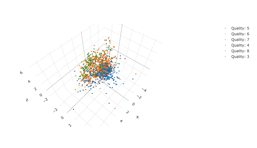
今回の結果だと、perplexityは30が良さそうなので、この結果をplotlyで確認してみます。
Y = create_single_3d_tsne(scaled_X, y, y_items, 30)
create_single_plotly_3d_scatter(Y, y, y_items)
結果のスクリーンショットがこちらです。
生データの時よりも上手く分かれているように見えます。
perplexityがガウス分布の分散を決める時に寄与していることから、多次元空間でのデータ点同士の位置関係に対して標準化の影響が出ていると考えると自然な解釈になるのではないでしょうか。
PCAとの比較
最後に、今回のデータに対してPCAを施した結果とも比較しておきます。
from sklearn.decomposition import PCA

pca = PCA(n_components=3)
df_for_plot_pca = pca.fit_transform(scaled_X)
create_single_plotly_3d_scatter(df_for_plot_pca, y, y_items)
結果のスクリーンショットがこちらです。
今回の場合はPCAでも十分だったかもしれませんね。
まとめ
t-SNEのコード例とperplexityを振った結果の確認、標準化との組み合わせトライアルを行いました。
perplexityはいくつも試すのが基本的なアプローチになるので、使用する際は覚えておきましょう。
また、標準化との組み合わせは、perplexityの意味を考えると、背景が想像できるかと思います。
それを踏まえて、標準化は描画時の選択肢に入れておくのは一つの手ではないでしょうか。
PCAなどその他の可視化手法で十分な場合もあるほか、そもそも何を目的として可視化をするかなど、考えるべきポイントはありそうですが、非線型変換の可視化手法として有効な手段ですので、上手く活用していきましょう。
参考資料
https://archive.ics.uci.edu/ml/datasets/wine+quality
https://distill.pub/2016/misread-tsne/
https://scikit-learn.org/stable/auto_examples/manifold/plot_t_sne_perplexity.html#sphx-glr-auto-examples-manifold-plot-t-sne-perplexity-py
http://www.jmlr.org/papers/volume9/vandermaaten08a/vandermaaten08a.pdf
https://plot.ly/python/3d-axes/
perplexityの意味などを確認する場合はこちらの記事もご参照ください。